(Guest Post by Matthew Ladner)
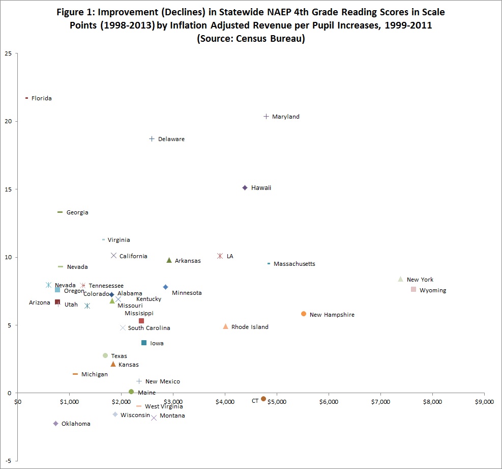
Which is a relief since we are running out of money in any case. I took a stab at updating my favorite state NAEP chart ever for the 2013 NAEP. My favorite chart ever of course is:

I decided that it would be a bit easier to digest to do the chart by individual subjects and use points rather than percentages of a standard deviation and combined tests as an axis. Also revenue per pupil was easier to find than expenditures. So what you see up there is a first crack at 4th grade reading between 1998 and 2013. No shock- money is still not the answer (yes I am looking right at you New York and Wyoming).
8th Grade Reading Chart looks pretty similar:
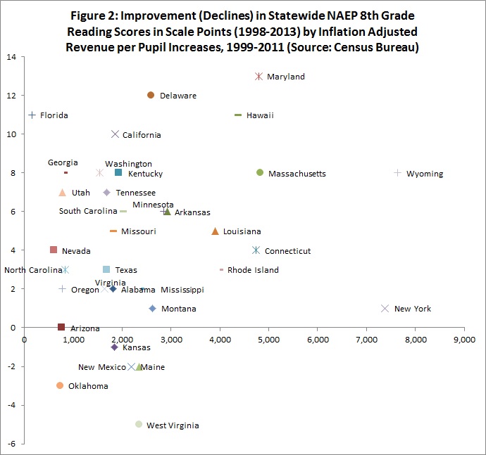
Wyoming at least scores meh improvement this time for their gigantic increase in spending, New York- fuggedabouit. Florida just blew you a kiss from the top left quadrant and said that you should come up and see her sometime.

In any case, these are prototype charts that have as yet been double checked by no one other than our family cat Charlie. Treat them accordingly for now, just putting them up for fun and feedback.


*prototype
Thx-fixed. Did I spell fuggedabouit correctly? That one never made my spelling word list while attending Texas public schools.
There are multiple correct spellings of fuggedabboutit. Some people are militant about their preferred spelling but I say ‘sallright.