(Guest Post by Matthew Ladner)
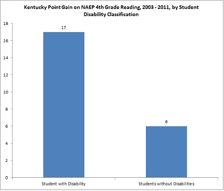
So does the data in this chart look fishy to anyone but me? What about after you read this?
(Guest Post by Matthew Ladner)
So does the data in this chart look fishy to anyone but me? What about after you read this?
 7 Comments |
  NAEP | Tagged: 2011 NAEP, Kentucky NAEP Scores, NAEP exclusion rates |
  Permalink
 Posted by matthewladner
